I’m working on a project called SnappyEverAfter. It’s a wedding photo sharing with mobile apps thing. Like disposable cameras. But with smartphones.
While working on this I had to deal with some tricky CSS bits, and I’m so proud with one particular trick that I want to share it there.
So, the task: on the website, I’ll have a grid of thumbnails, the thumbnails would have hover effect, and respond to clicks and drags.
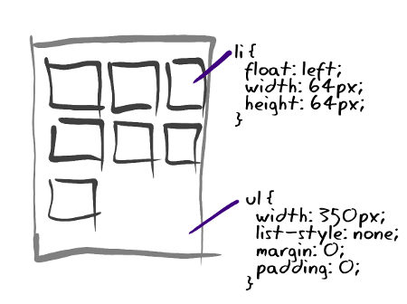
OK, I’ll just start with UL and float its LI’s:
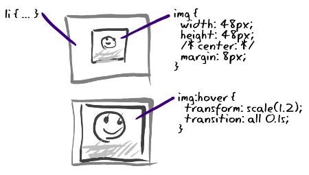
Inside each LI there would be IMG, centered using margins. At first my hover effect was just a border, later I added scale effect, and even animated it, because it’s just so easy to do with CSS3:
I’m omitting vendor prefixes and other stuff here for clarity. I added some rounded corners and drop shadows too and this is how my thumbnails looked, with one of them zoomed in:
Sweet, all done! Except, uh, … “transition: sclale” thing was making my Chromium crawl. Don’t know why. Anyway, instead of that, we can do the zoom effect by changing size and margins (and animate that too!):
Chromium was quick again, Firefox quick as ever, IE9 OK too, but no border or shadow cuteness in IE8! Also, with 20 separate thumbnails I was making 20 HTTP requests, not optimal.
At first, I did get IE8 stuff working with CSS PIE, but it’s a hack… There’s some flicker, and it interferes with my drag&drop. I guess, because it is sensitive to z-indexes. And still the 20 requests nastiness…
It was time for CSS sprites! CSS sprites is a technique of putting many small images in single big picture, so they download at once. At display time use “background-position” CSS rule to shift the big picture around. That’s the traditional approach. And I can pre-render rounded borders and drop shadows in the sprite image!
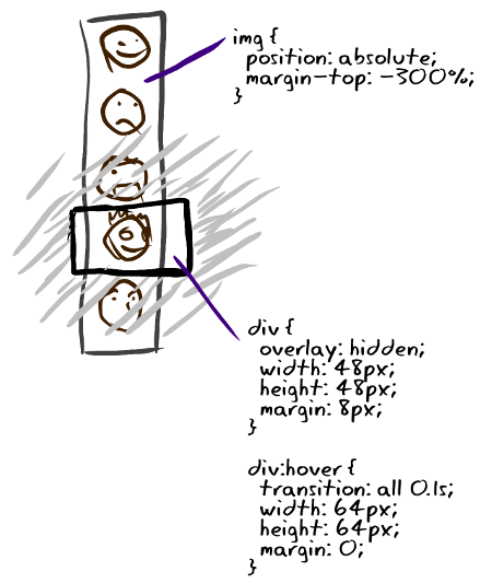
My problem with traditional approach is that one cannot get background to scale. There’s “background-size” CSS rule but that’s not well-supported. “transform: scale” is out because of performance problem. One interesting idea I encountered was to put icons in webfont. Clever, right, but only works for monochrome vector data. But then there’s an idea of using DIV and IMG inside. DIV would be “overlay: hidden” so it would work as a mask, IMG would be absolutely positioned so its correct region is seen through DIV:
See, IMG is like a filmstrip, and DIV lets you see only one frame of it. On hover, I adjust both vertical offset for IMG, and size of the DIV. And I animate both. Well it kind of works in Chrome and Firefox, a bit wiggley but works. I assume it is wiggley because there are several properties independently animated, these are in floating point values, and rounding errors cause things to jump forth and back a bit. In Chromium, I got an artifact with frames not lining up during animation. Again, the problem seemed to be with independently animating several properties and rounding problems.
Also, IE9 appears to be totally uncool about relatively positioned elements in large quantities. It gets slow, very slow. OK, so here’s my fix to both problems:
First, IMG is offset with negative margin, not “top” rule. So DIV doesn’t need to be relatively positioned and IE is happy.
Second, offset is given as percentage. This way, I don’t need to animate offset, and the problems with animating several things at once go away. Looks nice and sweet on Chrome, Chromium and Firefox. Looks correct with shadows and all on IE too, no animation there though. And all thumbnails load in one request. And it’s fast, and fluid. It’s beautiful!
That’s it, now I’ll go back and hover over thumbnails and stare at the effect some more 🙂


